How do you design for historic theater interiors? We interviewed Wilson Butler's Lead Interior Designer, Rebecca Emanuel, NCIDQ, LEED AP, IIDA, on designing for the historic Altria Theater.
Interview with Rebecca Durante, Principal & Interior Designer, Wilson Butler Architects
How does your approach to designing interiors change when it’s a historic renovation?
Well, it is the research that we do for any project, but enhanced. There’s something more to focus on, and it’s more than just inspiration and precedence. We’re digging up historic info and old photos to see how the building was used over the years, what it was decorated like, the furniture, the different functions of rooms and how they interacted, and what has changed over the course of all the years.
Also, with The Altria, I learned to work pretty closely with the historic preservation painters because of the materials and colors they were coming up with. In the case of the Landmark (Altria), everything was painted over, so we didn’t know what anything was except for a few areas that were exposed. However, these areas were so decayed you couldn’t tell what they were. All the colors looked muted, and then they (the historic preservationists) handed us a stack of ‘brush outs,’ they call it, where they just take the color and brush it over a piece of paper. It does kind of make it pretty difficult because you’re looking at 8 1/2 by 11 of a color that might only be used on the leaf of a flower every 3 feet. You’re thinking ‘Wow! this green’s pretty intense! How do I deal with that?’ You don’t have the best idea of what is going to be used where, so it’s a challenge.
So the preservationists might use it in a very small scale, and they give you all the colors equally for inspiration.
Exactly, all equal amounts then I’ll figure out how this room’s going to feel. It was good to work with them and talk to them because they were able to point out “it’ll be a lot of this, and a lot of this,” but when it came to say, the stencils, we didn’t really know how they were going to turn out. Digging up old photos, it was all black and white, so no one really knew how it would feel.
Were there specific color pallets in the early 1900s that were used more frequently versus today’s colors?
Some of it. Like I said, it was really interesting working with the preservationists from Evergreen. Bryan from Evergreen, would point out, “This one, unexpected. I didn’t expect this”. He’s done over a hundred projects. He’d get excited, really pumped about a color, and then he’d pull out two others. He’d say, “These we’ll see on every historic project. It doesn’t matter the decade. It always shows up”. It was a peachy orange, and like, an olive green. He said orange and green is the most timeless color combo ever. I never really knew that. I guess it came back in the 70s.
What are additional challenges that you encountered that someone who has never designed a historic space may realize?
Usually working on the cruise ships or newer construction projects, we never have to deal with 36 inch doorways with doors on them to fit furniture through. These lounge chairs… well they are big. It was really awkward. In a perfect world, we would have been able to open the doorways more as it would improve the flow as well, but we could not due to historic preservation. It’s just a fact of how things were designed in the 1920s. There was only one piece that actually didn’t make it to the room that it was going to, but it actually worked better where it ended up.
For the rest of the furniture, though, it was like moving day at college–unscrewing the feet, taking the feet off, shimmying around doorways for the big sofas and what not, but we got everything in place. I never had to deal with that before. Modern performing arts centers barely have doorways between social spaces, and if you do, it’s double wide. People and things were smaller back then.
Do you feel constricted at all by the history of the place when you design or do you feel inspired?
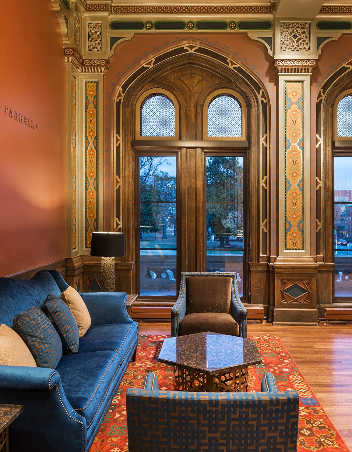
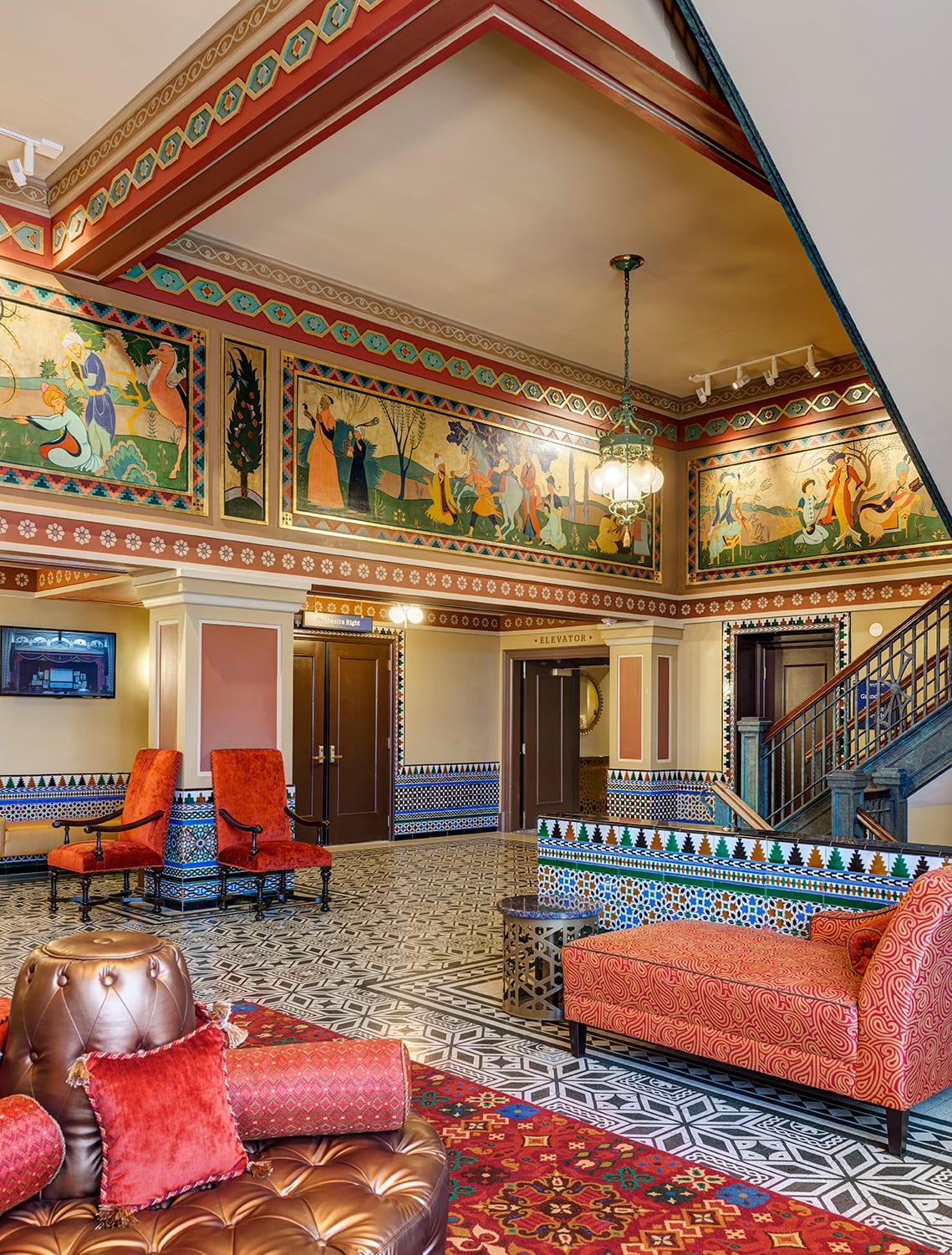
I would say inspired, at least working here at Wilson Butler (Architects) with the variety of work that we do and also how conceptually we work anyway, we really try to come up with an idea and an identity for a space before we design away. In this case, you’re kind of given that inspiration based on the history. In the case of The Altria, I mean the Moroccan aspect of it, the concept was there–now run with it, and design for that.
What do you like better, the historic renovations or a blank canvas?
I don’t know. That’s kind of why I went into interiors. If I was given a lot (of land) I wouldn’t know what to do with it. I don’t want to design a home for myself from scratch. I wouldn’t know what to put there, but I like improving and changing and fixing. I like working with something that already exists. I like starting with something, and then going with it. It’s kind of fun doing both the historic and the ship projects.
In regards to the Altria Theater, what challenges were presented to you and how did you overcome them?
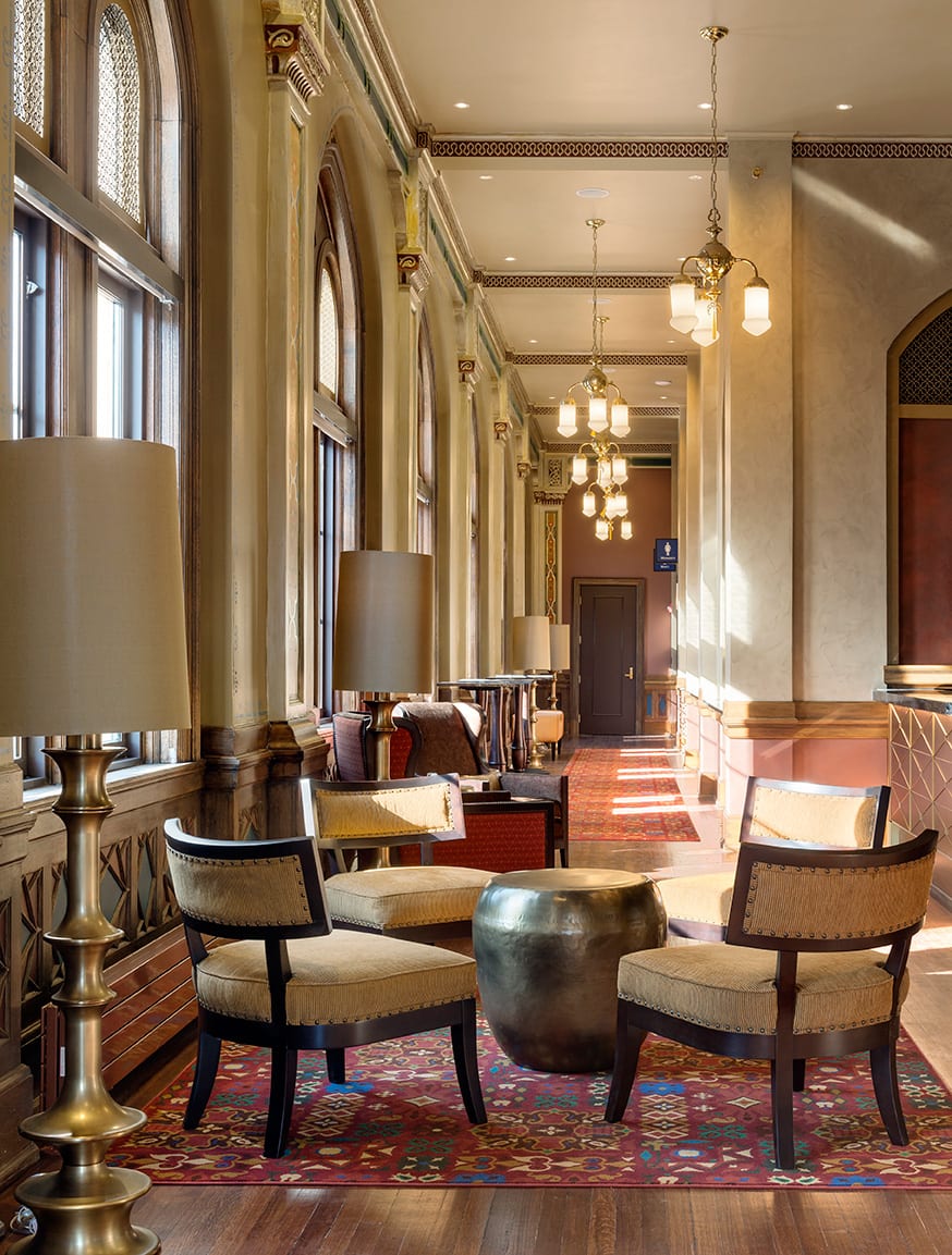
The strong color palette. That was challenging and not knowing how much and where and amounts of color and pattern. Also, how overwhelming these empty spaces would feel because they have these sixteen foot ceilings. It was like, okay, now let’s pick out furniture to live in here and be able to stand up to everything. That was a challenge. Probably more of a blessing than a challenge with the Altria was the number of extra spaces that this has as an old building. The fact that it was built kind of like a hotel too was actually a help, not the usual challenge of historic buildings where there’s no room for anything. Where you need more bathrooms and we don’t have room for it. Here we took out these hotel rooms that we did not need and added bathrooms.
So the extra space the Altria has, became what?
The third floor we added more lounges. It was a gift. It had more real estate that we could work with and use for modern day.
You brought such strong colors into the furniture, that beautiful blue chair, I just love that.
Everyone loves that one.
What was the inspiration behind that choice of color? Was that color already in the palettes from Evergreen?
I looked at the brush outs that we had and a lot of the colors, historic colors, can be a little, well odd. There was a bright blue and a bright green in there and I don’t remember the conversation exactly, but I think I asked Evergreen if they could explain where everything was going. There was a stack of probably 40 colors, and Bryan was telling me where everything was going and I was trying to visualize—remember, we’re not really looking at a photo. He’s like, “Well, these will be in flowers and this will be a border, and this will be,” and I just had to make those colors work.
I knew enough to know what would be an accent that people would see, so I just decided on the blue and the green, I could work with these. Later we found out we were going to have different lounges with different sponsors, so I thought, well, that’s one way to remember them. They’re going to have the same paint scheme, but it could be the blue lounge because of the upholstery and then the green lounge, that kind of thing.
Any additional challenges?
Another challenge is the fact that we phased all this out, so actually this (blue lounge/green lounge) concept came along later. We did the third floor lounges first when less was known about the historic paint. I didn’t even have the brush outs at that point. I didn’t know what colors would be going in on the first floor lounges that are more signature The third floor lounges are the ones in the hotel rooms. They’re kind of completely new spaces that wouldn’t have that kind of detailing and whatnot. At the time we picked the red and gold based off of what seems to be major colors in the building anyway and just kind of classic historic.So those lounges kind of have more of a red and gold kind of scheme. We ended up with blue carpet in there as well.
A lot of this was just hoping it would all come together, because we were only seeing little parts of it at any one time.
What if anything would you do differently on the project?
Allow more time for custom finish development. I feel like that was a ‘lessons learned’ for me. I say allow more time for custom finish development and push for that to make it perfect. Like I said, a lot of people might not notice these things, but I don’t think you get into this field without being a little bit of a perfectionist.